04
This document is designed to help maintain consistency and coherence in our communications. Here, you will find technical, emotional and personality specifications of our brand in different contexts, understand a little about the audience and several other aspects that encompass Zero Defect. We hope that this document serves as a guide for constant reference, both by managers, employees and any collaborators or partners looking to understand and communicate our brand accurately.
Logo
Our logo is simple, elegant and modern, exactly how we want our stakeholders to perceive us.
HORIZONTAL VERSION
INITIAL VERSION
HORIZONTAL VERSION - ENG
INITIAL VERSION - ENG
HORIZONTAL VERSION - PTBR
INITIAL VERSIONS - PTBR
VERTICAL VERSION
maximum reduction
Please do not scale our logo below these measurements.
On screens: 10 px
Printed: 4 mm
On screens: 20 px
Printed: 6 mm
On screens: 20 px
Printed: 6 mm
spacing
The following diagram illustrates how to create the minimum margin of space around our logo.
incorrect usage
EXCLUSION OF ELEMENTS
Please do not delete any brand elements.
CHANGE OF PROVISION
Please do not change the arrangement of the information.
INCLUSION OF NEW INFORMATION
Please do not use the symbol and logo together.
RANDOM COLORS
Please do not use colors that are not part of the palette.
COLOuRS
Different contexts call for different variations, these are all the possibilities of our logo.
A simple rule of thumb to maintain visual coherence in layouts with the application of color.
Our main colors are the darkest shade of purple and white, which should always be used as background colors or backgrounds in addition to being used in texts, always aiming for contrast.
The two brightest shades of purple are used in 30% of the application, that is, in visual elements that occupy the second largest scale of the layout. Yellows are highlight and contrast colors and should represent 10% of the application, when their application is necessary.
#ffffff
R255 255 B255
C0 M0 Y0 K0
#160D2B
R22 G13 B43
C75 M75 Y0 K75
pantone 276 c
#834FFF
R131 G79 B255
C75 M75 Y0 K0
pantone 2725 c
#643AC9
R100 G58 B201
C75 M75 Y0 K25
pantone 7670 c
#F9BB6E
R249 G187 B110
C0 M32 Y63 K0
pantone 7507 c
#FFEDD9
R255 G237 B217
C0 M8 Y17 K0
TYPOGRAPHY
The brand's typefaces were chosen to reflect its personality and ensure legibility across different formats and platforms. They play a fundamental role in building the brand's visual identity and ensuring consistency in communication.
Usage rules
size
space
use
x
x
caption
x
x*1,5
paragraph
x
x*1,0
title
x
x*1,5
highlight
Letters
AaBbCc
Exemplo
AaBbCcDdEeFfGgHhIiJjKkLlMmNnOoPpQqRrSsTtUuVvWwXxYyZz
0123456789
Numbers
01234
Presentation
Hi, I'm Space Grotesk, the new official font from Zero Defect.
I am modern, futuristic and have a strong personality. I must be used in ALL CAPS and “medium” weight for titles and “regular” weight for running text.
GRAPHICS
Our graphics were created to add dynamism, technology and simplicity to compositions. Therefore, they should be used in an expanded way, deconfiguring the icon in question but always trying to make a reference between the icon and the subject of the layout. Some examples are on the following pages.
ICONS
Our icons were created following the same pattern as our logo, so try to follow the guidelines as much as possible to maintain consistency. If it is not possible to use our own brand icons, we suggest using icons without fill and with slightly thicker borders, following our simplified icons.
SIMPLIFIED ICONS
ENCOURAGED ICONS
PHOTOGRAPHY
Humanizing a technology company’s image, especially in software testing, strengthens emotional connections and differentiates the brand in a cold market. Real faces generate empathy and trust, and bring the company closer to its customers. This increases engagement and highlights the company as an authentic and innovative partner.
STYLE AND COMPOSITION
AUTENTICITY
Spontaneous and natural photos, avoiding forced poses.
huMAN PERSPECTIVE
Prioritize angles that place the viewer in the position of the person using or developing the technology.
NATURAL LIGHT
Cool tones to connect with the brand's visual universe.
Focus on details
Close-ups of screens, hands typing, interactions with devices to create a more realistic narrative.
THEMES AND ELEMENTS
PEOPLE IN ACTION
Teams collaborating, testers discussing insights, real users interacting with products.
REAL WORK environments
It is interesting to address the company's daily routine, for this, we may prefer real photos.
DIVERSITY
Inclusive representation to convey accessibility and global innovation.
TECHNOLOGY
Well-framed screenshots of devices, dashboards and software in use.
CONCEPTUAL
Abstract images with plays of light and shadow, representing innovation and technology.


prompts
Realistic photo in a modern editorial style, showing a diverse team collaborating in a tech coworking space. Captured at eye level with a Canon EOS R5 and 35mm lens, using soft natural lighting with warm tones. Layered composition and rule of thirds highlight natural gestures and spontaneous interactions. No VFX, purely authentic moment, 16:9
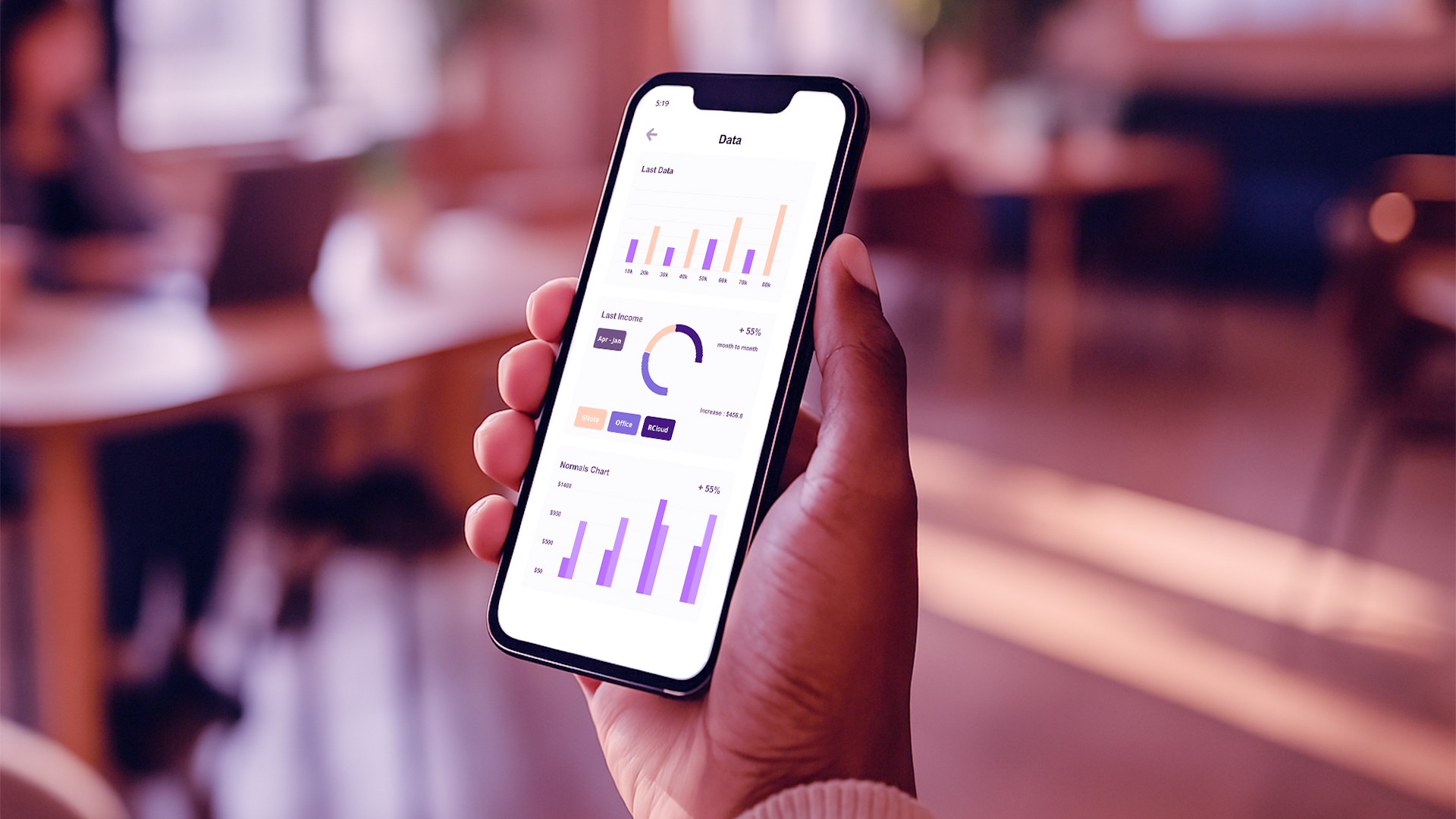
Over-the-shoulder shot of a real user interacting with a mobile app in a sunlit tech workspace. Captured with Canon EOS R5 and 35mm lens, using natural lighting and editorial-style composition. Focused on spontaneity and authenticity, with no VFX or artificial posing, 16:9
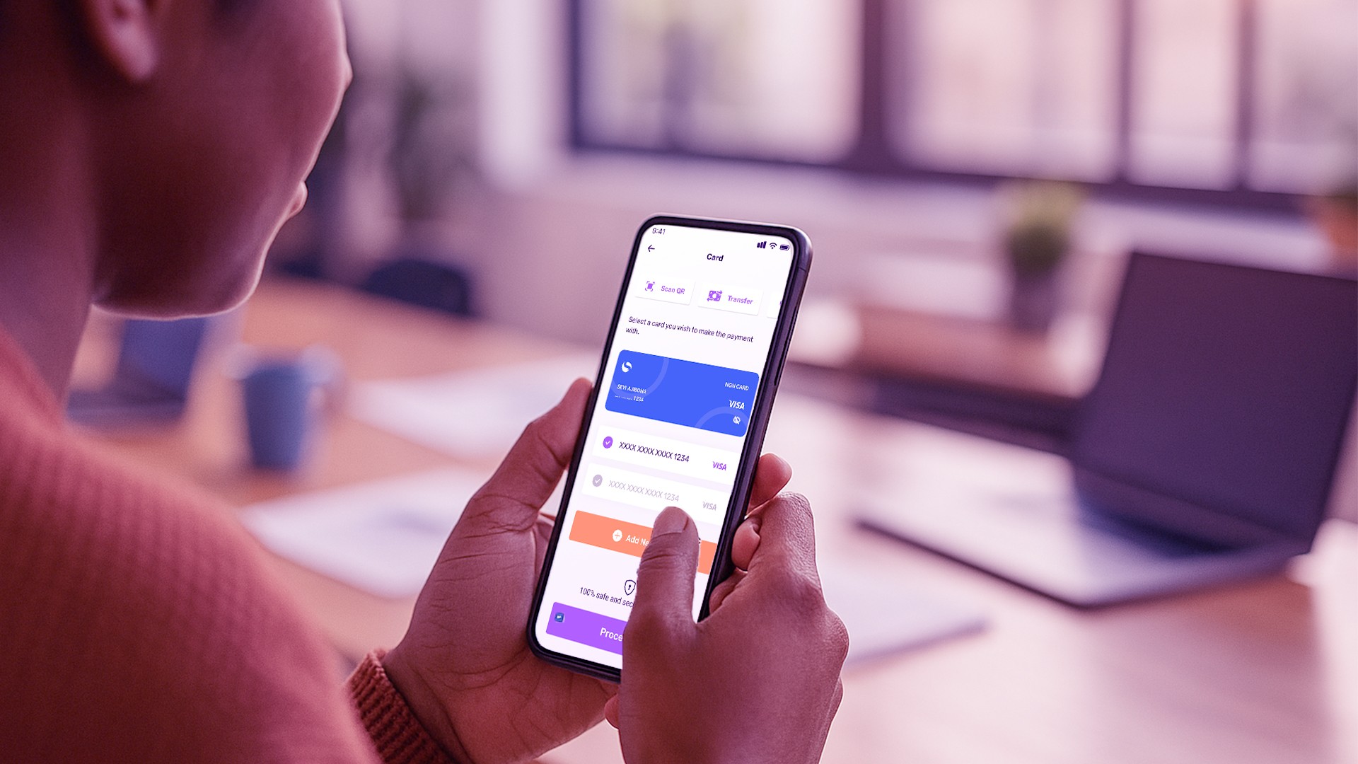
Close-up shot of a diverse hand holding a smartphone displaying a clean UI interface, in a real coworking space flooded with warm natural light. Shot with a Canon EOS R5 and 50mm lens, focusing on authentic interaction and editorial clarity. Layered composition adds depth with no post-processing effects, 16:9
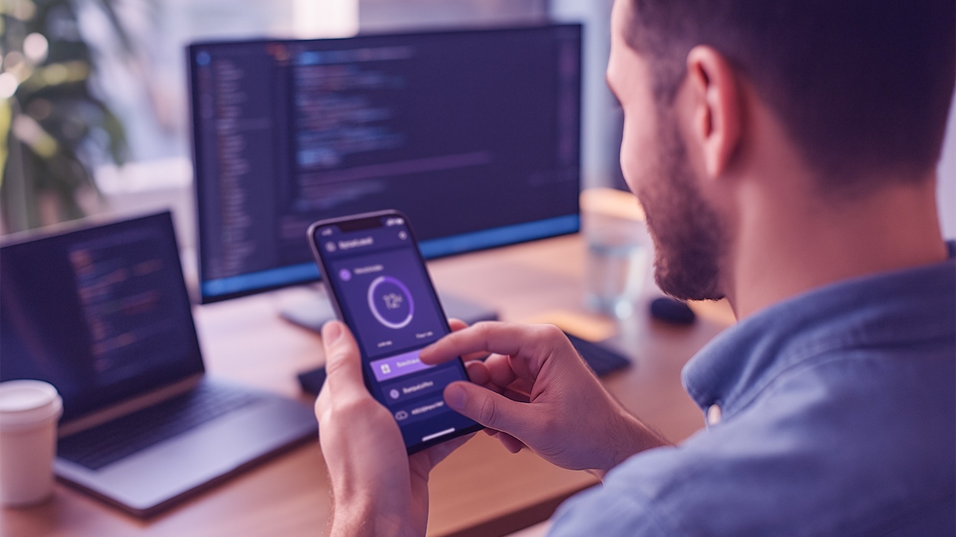
Close-up of hands typing on a laptop with a UX dashboard on screen, captured in natural light with a Canon EOS R5 and 50mm lens. Editorial modern style with a realistic atmosphere, warm tones, and layered composition. Real environment of a startup office with no artificial effects, 16:9
Candid photo in a modern editorial style, showing two coworkers in discussion over insights from a UX test. Captured at eye level with a Canon EOS R5 and 35mm lens, soft natural lighting with warm tones, inside a real tech office. The composition uses the rule of thirds with a clear foreground and background, emphasizing body language and genuine expressions, 16:9
Wide-angle shot of a tech startup office with people working in the background, captured in soft warm daylight. Realistic and editorial, using Canon EOS R5 with 35mm lens at eye level. Natural composition with elements of teamwork, digital devices visible, no stylized effects — just authentic modern tech work culture, 16:9
Download Brand Assets
Need to use the Zero Defect brand?
Download all official files — logos, visual elements, and guides — and keep every application consistent and on-brand.